JackSpot App
mobile & web application
In 2018, I was working for an ambitious project of a startup. With a great team, we built a very innovative mobile application for local communities. It was a native application for iOS, Android, but we also built a web version. The challenge was to create a competitor of NextDoor with a better user experience.
In this section of my portfolio, I'm explaining the different steps of the project and my way to handle different tasks, challenges. I led the design of the product between February and November 2018. I stopped working on the project because the startup was struggling to get more funding, but the feedback of the first users was very positive.
For me, the most important about team collaboration is to find compromises, to be positive.
Consistency, quality, simplicity are essential during all stages of a project. Why? Humans are very talented to create a mess or to complicate things. My experience building different type of products helped me to focus on these three priorities.
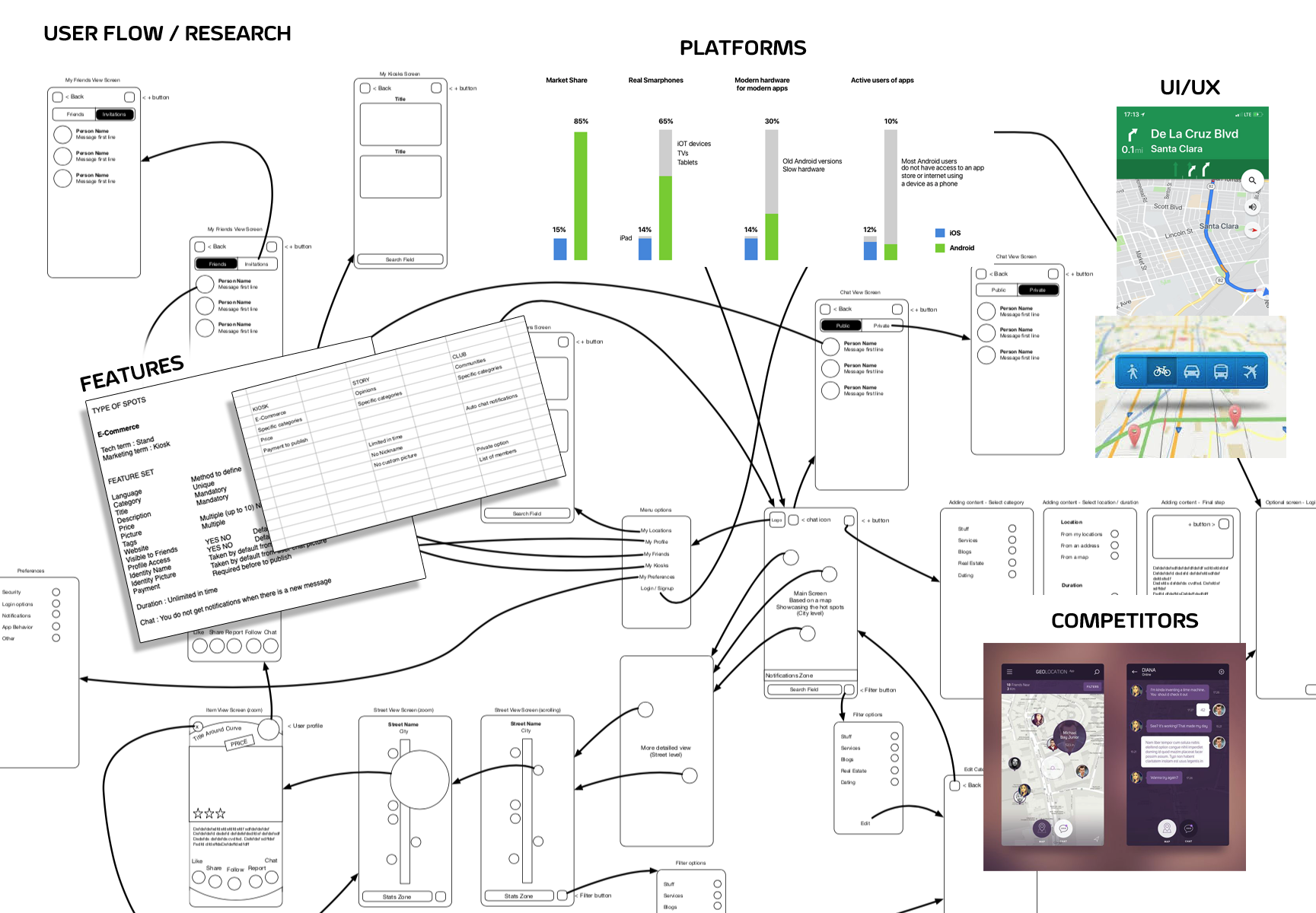
STEP 1 - Research / Persona
I worked with the team to determine what goals the project needs to fulfill. It's mostly about the list of problems to solve. It's not a simple task, but the key is about communication, listening to all opinions.
This step was in close collaboration with the CEO, managers and stakeholders, but I also like to involve engineers. If questions aren’t all clearly answered in the brief, a whole project can set off in the wrong direction. For Jackpot App, the CEO had a main idea but no directives on features and type of users. With the team, I worked during many weeks to define the default features. We studied competitors and determined the pain points. We tested more than 10 apps with different focus. It was clear after this period that we can build a much better product than Nextdoor.
We had to find something special, different from other competitors because the UI/UX was "Deja Vu", not creating any "Wow" factor.
I selected the design features into four main categories: “Efficiency of use”, “Location flexibility”, “User engagement” and “Privacy”.
We worked on many brainstorming sessions, and we found a creative way to connect with people around a specific location.
To keep user privacy, we decided to allow the user to create a spot on a map at any location he wants.
The spot will be a way to chat with other users visiting the same area/topic.
This is a period where we also studied the technologies to use for the product. We tested different SDKs, and we selected Mapbox as the main framework for the map experience. For the backend, we selected Amazon AWS services. This is also the stage where I created a persona, figuring about which type of users are going to work with the product. For the native App, we targeted users between 18 and 30 years.
STEP 2 - Wireframes
At this stage, I started digging into the user flow, defining how the content and features we defined in scope definition will interrelate. It's important to describe the relationships between the various pages and content elements. Although a wireframe doesn’t contain any final design elements, it does act as a guide for how the project will ultimately look. During this process, I thought about how the layout and content could be structured to satisfy user and business goals in a technically feasible way. I created a UI requirements document to outline all the features and elements I wanted to incorporate into the design. Once this was complete, I started creating digital wireframes for the main screens in Sketch.
I always prefer to build a prototype to test the user flow. I asked engineers to test out the prototype's usability. During brainstorming sessions, we were debating about each feature and interaction. The goal of the team was to validate the UI/UX to see if it was obvious for any kind of user. This helped us identify user frustrations we needed to address, so we could improve the design. I often went back to the drawing board to adjust key task flows accordingly.
One of the most exiting things about building a new product is being able to experiment and take risks

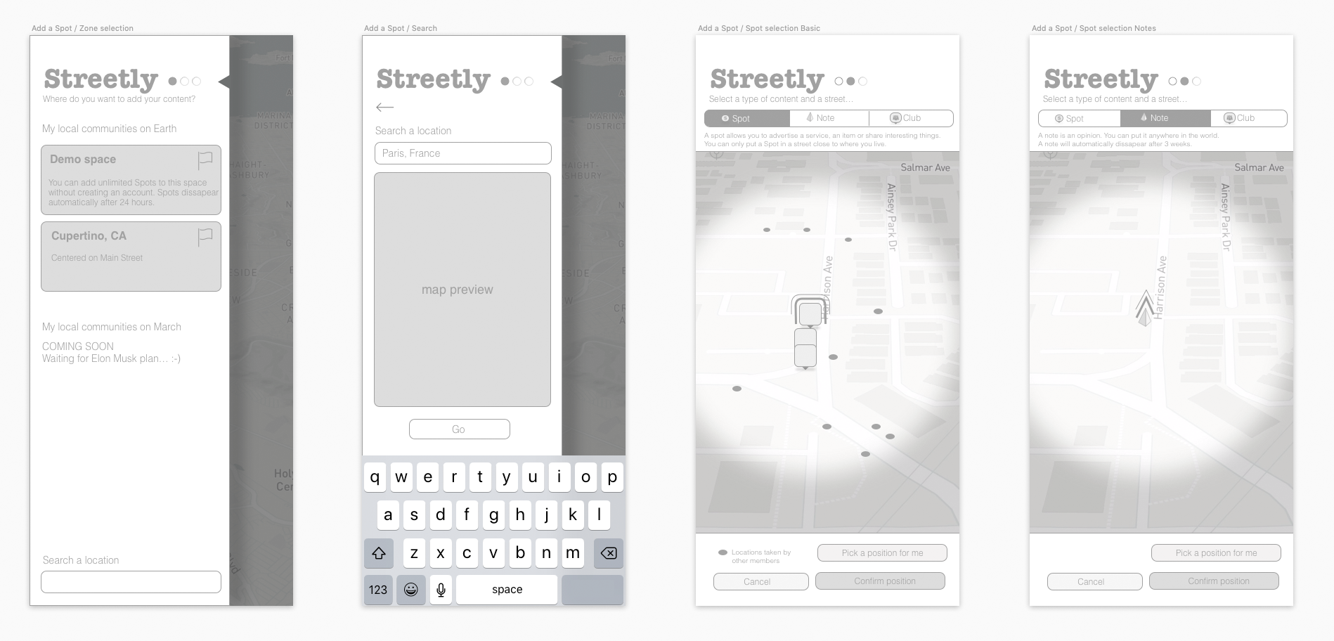
STEP 3 - Content Creation / Mockups
After updating my wireframes to incorporate the feedback, I moved on to visual design.
I started working on the identity of the product, the look & feel of the app.
This part of the design process will often be shaped by existing branding elements, color choices, and logos, as stipulated by the company, but in this case,
I had to start everything from scratch.
I wanted to keep the interface simple and minimal, yet colorful as well as playful and attractive.
I created an interface which make it easy and pleasant to add information.
Colors quickly inform the user what he/she can interact with and where the important pieces
of information can be found. I submitted many iterations of the logotype and style of the UI/UX to the team.
A theme inspired by earth with a specific blue and green was appealing for most members of the team. Next, I started brainstorming logos.
Coming up with brand adjectives helped me narrow my vision. I sketched ideas first, and then created digital versions of my favorites.
I added logos to the Style Guide and UI Kit, a comprehensive collection of all site components and UI pattern useful for the developers.
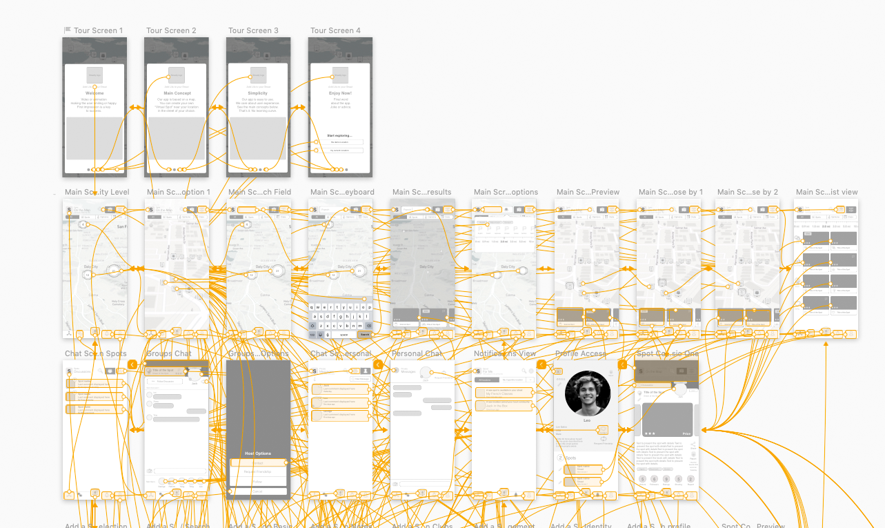
STEP 4 - Testing / User feedback
At this step, it's time to make sure that everything works. It's important to detect user experience issues before to launch a product. Errors may be the result of small coding mistakes, and while it is often a pain to find and fix them, it’s better to do it at this stage than present a broken product to the public. It's the period where we can still make changes before to launch the solution. Collecting the user feedback is critical after the launch of a product. Issues and frustrations explained by users should be fixed asap, otherwise the word of mouth on the product will be negative.
From JackSpot project, I learned that spending time with engineers to explain the value of some design decisions is worth it. They were much more open to implement features and appreciated the assistance in their coding effort. They realized that it was moving the product forward, with a much better quality. I also learned that compromises are a solution, with managers and stack-holders, for many reasons. I will never forget this period of my life, as most members of the team are now close friends.

JackSpot is very cool to use. The user interface is beautiful and intuitive. Compared to Nextdoor, it's like day and night.
NOTE: You can click on the pictures of this page to see details.
You can also see more screenshots of the app on the final website
Copyright © 2016/2022 | digicali.com
![]()